Monday, 13 December 2010

13/12/2010 - Male/Female Artists - Further Reseach

 Ideally the model that I use for my magazine front cover will dress similarly to Brody Dalle on the front cover of this magazine. I am aiming for a punk/rock style and a model who can produce an aggressive and intimidating look. In this picture she comes across threatening and you can guess what genre of music she is involved in. I'm  not entirely sure that I would use this pose this I researched some more photographs of her.


I found this picture where you can only see a shot of her head and her neck. I like this because it is simple but still conveys her to be intimidating like that the other image of her. The colours in this look a lot more defined and better quality. Her pale skin compliments her red lips well and the shadow underneath her face and to the right create more definition.


I also found this image which depicts not only her perhaps intimidating personality but also her feminine aspect as she comes across quite manly in photographs of her. She is dressed in black once again and her skin remains predominant and goes well with her black clothing and hair. Her makeup is dark and not particularly feminine along with her clothes. The pose that Brody is demonstrates her power and her sexuality through what she is wearing.


Currently, I am undecided about who to select as my model so I have chosen to research both male and female artists who I think could help to influence my photographs. Although I have looked pictures of Brody Dalle flaunting her assets and remaining intimidating it does not necessacarily mean that my model will use the same poses. I will probably use aspects of clothing and facial expressions as influence.

 In order to choose what kind of model I would use for my magazine I decided that it would be valid to my research to explore both genders and how they can be presented through images. Here is a photograph of Frank Carter displaying his tattoos to the reader. The magazine is a special edition in which it tells the reader 'The Cool List 2007' and obviously he is involved in it as he is the main artist shown on the front cover. His pose is evidently manipulated to convey his coolness and perhaps threatening personality. The way in which he displays his tattoos is unreserved and he looks quite intimidating to the reader. The model stands out and he is dressed in a plain black blazer with his pale skin boldly standing out over a background covered in words. As he is the lead singer of his band this could show his position and status of importance as well as implying that he could be in the 'cool list'.

After researching the use of an image of Frank Carter on a music magazine it seemed appropriate to look at another photograph taken of him and how he has been portrayed. In this image we can see that he is once again exposing his tattoos which are obviously an important part of him. It also gives the impression that he perhaps he is a strong person and someone to fear. His pose is powerful, he has his hand across his chest and showing a swearing symbol. Just like the female model he has attitude and seems intimdating to the observer. If I use a male model I would probably choose a pose similar to this as it is simple but shows how the model is dominating the image and can portray their attitude and the genre of the magazine.

Wednesday, 8 December 2010

29/11/2010 Music Magazine - Research

In order to produce a music magazine I need to research certain aspects of images used for the front cover. The clothing of the model is important as it portrays the personality and the mood of the magazine.


Until I started researching magazine front covers I had never actually heard of this magazine before and although I had not read it either I was quite keen to. The leader singer of the band 'The Killers', Brandon Flowers, is featured on the front cover of this issue of SPIN magazine. He is seen wearing a purple velvet suit and holding a crown whilst seated on a throne. He is presented in a regal manner and is staring at the reader with a look of self-importance. Flowers looks powerful and and full of confidence and this is portrayed not only through his attire but from the pose that he has been positioned to sit. The light highlights certain areas of his face and shades the left side. The model looks comfortable and attracts the reader to look at the cover of the magazine. The colours used in this photograph compliment each other well and allow the model to be the main focus.


I looked at another issue of SPIN magazine and came across one with the band 'No Doubt'. The band is also presented here to be quite domineering and to some extent intimidating. They are dressed smartly and the lead singer is evidently not dressed in a suit like the men to draw attention to her. Even the background of the magazine matches what they are wearing but it skillfully does not class and the although the writing is also black and white, the band remain the prominent feature. Each member's facial expression is different which could be a reflection of their personality. The model on the far left is posing in reserved manner, the model next to him looks content, the centre model is obviously the main focus and is extremely confident in her pose as she leans forward demonstrating her position in the band. The model on the far right seems perhaps a little intimidating with his grin and the fact that he is pointing at the reader directs their attention to the front cover. Even the colour of the lead singer's nails and lips and the model on the rights hair match the colour that are consistent throughout the cover. The hair of all the models has been styled similarly apart from the female's and they all have their own individual pose to reflect their personalities which could also be shown through the clothing that they are wearing. More light has been used on the singer so that she is the focal point and the other members have had their faces highlighted with lighting.


I think that this magazine is different to the SPIN magazine as it obviously caters for a different type of music genre and the layout is not the same. The band 'Rancid' are featured in this issue of Big Cheese and simply from this image you can see that they are being portrayed to be intimidating and powerful. In contrast to the previous issues it seems that the band are dressed in perhaps their own clothes as they do not seem to be wearing clothes that compliment each other and the colours of the magazine. However, the colours are consistent throughout the cover tend to be blue, red, white and black which each member is wearing. All of the members have similar poses and are conveyed to be quite threatening. There is more lighting on the prominent member at the front and there is less on the others. The reader can see their whole bodies which reinforce their power and the band name is positioned in the centre of them clearly so that we know who they are.


Saturday, 27 November 2010

Preliminary Task: Evaluation Questions

1) In what ways does your media product use, develop or challenge forms and conventions of real media products?
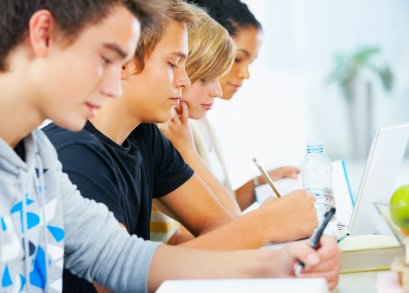
My media product uses the conventions of real media products as it addresses the target audience by the way that the images that I have used are school related. During my research into school type magazines I found that it was common to have images of students studying and students in their uniform. For my magazine I used two of my friends who are sixth form students and placed them outdoors with folders in their hands. I did this mainly because I knew that the natural light outside would help and because I was not particularly experienced with lighting equipment.

I found that the title of a magazine was important so I used 'Wilmington News' because it is appropriate for the school and is simple. I admit I could have been more creative but I liked this title because the reader will know what the magazine is related to and I incorporated the letter 'n' at the end of Wilmington into the 'N' in news.

The school logo was also a significant part of the media product as most real media products include the magazine's logo on the cover. I placed it at the bottom of the front cover and on the contents page to give a consistent feature. Similarly, to a real media product I included the issue number and date at the top of magazine. I think that my media product would be a free magazine if i was real so I did not include a bar code because my research did not support having one. I used varied sized titles and colours to give the reader information about what is inside and the research that I did showed that did sized fonts gave a strong structure to the front cover. On my contents page I used a big title and for the contents list I used numbers and two different colours. The first colour was the state the page and the second was to illustrate extra information about the page. I used another image on the contents page with is supported my research but I also included a border which was reflected by my research but the design was altered.

2)How does your media product represent particular social groups?
I think that my media product represents girls aged 16-18 because the models that I have used in the images for my front cover and contents page are sixth form students. The clothes that the models are wearing are quite smart and represent the older students who wear business style clothing. My media product is aimed at girls because the school that the product is created for is a girls school. I do think that other social groups of different ages are represented in the school due to the titles and content that I have included in the text. The content shown on the front cover is 'Pamper Day' , 'Parent's evening', 'Sports Day' and 'Netball Tournament' which could appeal to the rest of the school. I think that the magazine could also be read by the parents of the students as it would give an insight into the events taking place at school. The layout of the magazine is quite mature and does not feature lots of images and bright colours so I think it would be read by the older students or parents.

3) What kind of media institution might distribute your media product and why?
I think that the school would produce the media product and then distribute it to the students/parents. The media product would probably be read more by the sixth form students, teachers and parents. It would be a free product which could be given to the students who pass it on to their parents at home. For this reason I think that the school as an institution itself would produce the magazines on paper and give them to the students for free every month. To be cost effective the school could print it in black and white to save ink and give them out to students like a newsletter.

4) Who would be the audience for your media product?
The target audience for my media product would be the older students in sixth form and their parents. The audience would probably be about 16-18 because that is the age of students in the sixth form and their parents would probably read it as well. The audience would predominantly be female as it is a girls' school and the only males who are likes to read it would be their fathers or brothers.

5) How did you attract/address your audience?
I aimed to attract and address my audience by using two images with students who are the same age as the reader. They are both girls which obviously relates to female readers who are sixth formers themselves. I have used mainly black, white and blue colours to keep the consistency in the colour scheme and keep it quite simple. I did not over complicate the layout of the front cover and contents page because the mature reader would probably not be as in interested in multiple images and would rather read the content. I used big titles on the front cover about upcoming events to draw the attention of the audience into reading the product.

6) What have you learnt about technologies from the process of constructing this product?
I have learnt how to capture multiple images using a Canon 500d SLR digital camera which I have never used before. To edit the images I used Photoshop and this helped me to create my media product by allowing me to alter the lighting and crop the size of the images. I used In Design to produce the text that I have included in the media product. Before deciding on a final magazine title I repeatedly typed out the words and tried different fonts and sizes until I found the appropriate one. I have learnt how to edit images and experiment with different fonts.

Wednesday, 24 November 2010

24/11/2010 - Contents Page Complete

This is the completed contents page for the school magazine. I am quite pleased with the final result as I feel that it is informative and interesting to the reader. I have kept the design quite simple with only an image to the right of the page and a border on the left. The colours that I have used compliment the image and the school logo well. After researching various contents pages it became apparent that they used thirds in order to position the page. I ensured that the text was on the left and the image on the right. Many contents pages listed the title and numbers of pages under the heading 'Features' so I also did this. I clearly labelled the page as 'Contents' and placed the school logo next to it. The date that the magazine has been published is in the top right corner with the school website at the bottom of the page. Each page is titled as to what it is with the page number next to it. Underneath some titles are a small amount of text about what the page contains. I have added a glow to the image on the right so that it stands out but does not distract the reader too much.


Tuesday, 23 November 2010

23/11/2010 Contents Page - Not finished

This is not finished but i've uploaded it to show progress.


This is the plan for my contents page.

23/11/2010 - Front Cover Completed

This is the completed front cover of the school magazine. Overall, I am pleased with the outcome and the style of the page. After taking 3 sets of photographs I finally chose one that I felt was ideal for the front cover of the magazine. I edited the size of this image and made areas where text is either lighter or a bit blurred so that the text can clearly be seen. The colours used for the text work well together and compliment the image and the school logo. Interesting pages from the magazine are written clearly on the front cover to attract the readers attention. In the top right corner I have included the date that the magazine was published and the issue number.

Wednesday, 3 November 2010

03/11/2010 - Final Photographs

I have already taken two sets of photographs and each time I have decided what needs to be improved in order to achieve the perfect image for my school magazine. The images below were my final attempt to do this and as well as my research, they have helped me take the photograph that I wanted.


Please press play to watch and hear about the final photographs.


1/11/2010 - Second Photographs

I cannot use this image for my magazine front cover because there are several problems with it. The lighting is not correct and therefore it makes the photograph too saturated. The blonde hair reflects the most light so it is distracting to the viewer and does create a perfect image. After taking my first set of photographs I have ensured that my models are wearing black clothing so that they are the main focus. The background with trees is perhaps still too distracting. I have taken the photograph close up so if I wanted to edit the image to a particular size or area I will have difficulty because I have already decided the distance. I have also cut of the model on the lefts arm and both the models legs so I cannot edit the closeness of the image greatly now.

 I quite like this photograph as the models look genuine in their pose. However, the blonde hair reflecting too much light is a problem again and I have taken the photo too close up. By taking the image too close it does not allow me the choice to edit how much of the image I would like to use. I have also included a bench and a bin in the photo; this would be easily edited out.

In this photograph it is difficult to observe the model on the lefts face which I think is necessary to see. The blonde hair is too light and so is the white folder that the models are holding, hence making it a distraction to the picture. The photograph should have been taken at more of a distance so that it would allow me more area to edit but I cannot now because the layout of the image is already chosen. I think I would also change the background so that there is not a wall because that is also a distraction.

Monday, 11 October 2010

29/09/2010 - Contents Page

I am now researching the contents page of magazines so that I can gain knowledge about how they are constructed. The contents page of a magazine tells the reader what they can expect to find within the magazine and what number page they can find it on. Below are some examples of contents pages that I have found and anayalysed.


I like this contents page as the design is simple but effective. It clearly illustrates what the reader can expect to find in the magazine. The colours of the font coordinate with the image of the yo yo and the title is bold and eye catching. The title of each page is in black and bold to distinguish the topic of the page for the reader and the page number is located closely.

I do not like the design of this contents page as I feel that there is too much going on and reader will become distracted. I like the way that the image of the lady is layered of the title. This gives the contents page depth and the border at the top of the page is relevant in colour to the image and the white background. The gold text perhaps suggests that 'icons' are golden and is therefore related to the image of Audrey Hepburn who is an established icon. However, I think that the colours of the fonts clash and I do not like the arrangement of certain parts of the text.
This is the contents page of a music magazine. I like the design and layout of this page as it is clearly constructed to serve it's purpose. The titles are easy to read and the pages are labelled boldly for the reader. The colours co ordinate and the image gives a visual insight as to what the reader can expect to find inside. There are different sections of the contents page that have been separeated with the same borders and the text remains the same. I am considering using borders for my contents page and I will ensure that the colours used co ordinate well.

Wednesday, 29 September 2010

29/09/2010 - First photographs taken

After researching various magazine front covers I have decided to experiment and take my own. As my magazine is school related I chose to use my niece as she is wearing her school uniform and could help pose for my photographs. These pictures are only taken with a digital camera so the quality is not great but it is part of my planning for when I take then final photographs.

I like the pose in this picture, although it is extremely mediated it creates warmth in the photograph. She appears to have a severe posture so I have helped make her seem curved by taking the photograph slightly side onwards. In order to improve this photograph I will need to take the picture front on, ensure that the lighting is correct as there is too much light reflecting on the paper and her face. It would also help if I dressed her in black so that there are no other distractions in the image and she is the main focus. The background also needs to be a nicer environment perhaps with trees so that yet again she is the main focus. I am quite interested in taking the photograph with the model as the main focus and the background out of focus.

I do not like this photograph as the model looks very serious in this picture and it is not particularly inviting to the reader. Although she is doing her work so it is school related it is not a well mediated image. The lighting is too dark and does not show any emphasis on her. The angle of the camera is looking down on her and should be front on. She also looks very uptight in this photograph and could perhaps benefit from a slightly more casual pose. I would also need to dress her in black and not cotton clothes for this photograph so that she remains the main focus of this photo.
This is similar to the first photograph that I have included in this blog entry. The pose is similar but she is less relaxed and happy in this image. Her posture is more severe and the camera angle is still taken side on. There isn't much light on her so it does not emphasise much detail and the background is a distraction. To improve this photograph, again, I would have to take the photo in a brighter environment with perhaps trees in the background but out of focus so that she remains the main focus. I would also dress her in black again so that she stands out.  

Tuesday, 21 September 2010

21/09/2010 - Experimenting with fonts

Today, we have been experimenting with the different types of fonts, sizes and font colours of text. Using the programme Adobe InDesign CS4 I have created multiple texts using different fonts, sizes and colours and I have experimented with this in order to find the correct title for my magazine cover.


This is a print screen of the first set of fonts that I experimented with. I have used different fonts and sizes and I will now select a few that I like and develop them further. The development will include colour, background and sizes.


This is my final selection of fonts that I have used for the logo. I have decided that I prefer the two fonts in the centre of the page in red. These are my favourites becuase I think that they will be easy to read, the different sizes of the letters make it unusual and perhaps memorable to the reader. I am still undecided as to which one I will use out of the two but they are much more developed in comparison to my previous fonts and even the fonts on the same page.

30/09/2010
I have decided to use this as the title for the front page of the magazine. After experimenting with multiple fonts, colours and sizes, I chose this one as I like the layout and formation of the letters. I may alter the colouring of the letters to suit the image but I am sure that I will use this font.


Monday, 20 September 2010

20/09/2010 - More research on magazine covers - photographs

During today's lesson I finished my research on different magazine covers. I then decided what I liked and disliked about each magazine front cover and after looking at the last magazine front cover I was able to take the idea of a child studying for an image for my magazine. I will now find various images that are similar and hopefully take my own photographs soon.

1)


In my previous blog entry I selected various magazine front covers and anaylsed the positive and negative aspects of each. From the first and fourth magazine front covers that I used, I decided that they would be beneficial in helping me to find relevant images for my own magazine. I have searched for 'students carrying books' in google images and found the above two. I like these images as I believe them to be well mediated, the lighting is flattering and not too over powering. The image quite clearly shows an academic theme and perhaps this pose would be perfect for my own magazine.


2)

I then anayalised my fourth magazine front cover and liked the image of a child studying. This would convey the message of education and students through the image to the reader. I searched for 'students studying' and selected these three images. I like each one as it shows the students content in their study and the photographs are taken from different angles. When taking my own photographs, I will consider taking them from various angles and ensuring that the lighting is perfect like these.


Tuesday, 14 September 2010

13/09/2010 - Magazine research

During this lesson we looked at student's work so far and how they have blogged. We then decided to continue our research on what makes a good magazine front cover. This includes arrangement, the photograph used and text and colours used. My issue of the school magazine is going to be focused on new improvements in the school, the recent sports day and upcoming charity events.

Magazine Research
I think that this magazine cover clearly shows what it is advertising but the photograph is fake looking and over posed. However, any photograph that would be used would be mediated. the photograph also lacks any definition and effects, so it is quite plain. The colours aren't particulary attractive and almost clash with one another. I do like the building in the logo for 'Home School' as it is clever but there are also empty spaces around the cover which makes it look a bit boring.

I do not like the cover of this magazine as I feel that it is not compelling and appears to be quite spacious and lacks information on the front. This could give the impression that there is not a lot of content inside. I do like the big bold title as it clearly portrays the name of the magazine and the colour and font is attractive. The photograph used posses great lighting but does not seem too relevant to the 'style' magazine as you can only really see the persons face; when you would expect to see clothing. The text at the bottom of the page is difficult to read as it fades into the image and does not fill the cover so it isn't really noticed. Although this magazine is not school related I thought it would be good to anaylse a different type.
This magazine is not clearly school related and the image appears to be squashed. The photograph used is not mediated well and does not represent the school as a whole. The quality of the image is not great and there is too much light focused on the person's face. The text is too colourful and overpowering and the various fonts clashe. The composition on the page is untidy and the fonts used are unattractive and there is not a consistent design throughout the cover.
I like this magazine front cover as it is the most relevant to what I will be producing for a school magazine. The image is well mediated and quite clearly demonstrates what the magazine is about. The text used is bold, consistent and the colours coordinate better than the other magazines. I like the idea of using a student studying for a magazine cover so I will use this idea to develop my own photographs for creating a school magazine cover.


Tuesday, 7 September 2010

07/09/2010 - Planning

Today we discussed and learnt how to use cameras. We focused on what makes a decent camera and how the more pixels that it has the better quality picture it will produce. To take a good picture you also need to ensure that the lighting is correct and the settings of the camera.

We then  planned who our magazine would be aimed and produced for.

School Magazine


The magazine will be produced for the Wilmington Grammar School for Girls which is located in Wilmington, Kent. It was built in the 1960s and used to be two houses belonging to the Whitehead family. It is now a functional secondary school for over 700 girls and serves as a sixth form also.


Target Audience – The students and parents.


Type of School – Secondary and sixth form. It specialises in maths and computing.

Monday, 6 September 2010

06/09/2010 - First Media Lesson

This is my first media lesson and we have discussed what media is about and what is to be expected within the course. Using this website, we looked at blogs created by previous students. We then signed up to blogger and created our own account and began to blog. Tomorrow we will bring in our own cameras and learn how to use them. This will help when photographing for magazine covers and to understand how media is produced.