Tuesday, 29 March 2011

Candidate Details

Jennifer Sarah Hall

Candidate Number: 5050

Centre Name: Wilmington Grammar School for Girls

Centre Number: 61119

Sunday, 27 March 2011

Final Media Products


7) Looking back at your preliminary task (the school magazine task), what do you feel you have learnt in the progression from it to full product?


When I first began the course I was set the preliminary task to create a front cover and contents page for a school magazine. For the front cover of my school magazine the layout is quite basic and although it is supported by my research it does not seem to be as structured as the front cover for my music magazine. The front cover for my music magazine is based solidly on my research and the titles, image and  text reflect this. I believe that since I started the preliminary task I have learnt quite a lot and it has helped me to create my final media product. I began to use Photoshop and In Design for the school magazine and through using these I learnt how to alter images and text by using the tools available. 

I feel like I have become more knowledgeable in the use of technology during the main task that I was given to produce. In the preliminary task I don't feel like I was prepared enough to use the tools in photoshop and therefore tended to just use resizing and cropping tools rather than experiment with healing tools. The main problems that I had with my images in the first task was lighting and had I been better at photoshop I'm sure I could have adjusted the brightness and contrast. In the second task I did much more research into the preparation of my magazine and made sure that it was relevant by addressing my target audience. In my first task it was quite obvious who the magazine was for but it did not have a more specific audience like my final product does. Through researching the type of reader for my magazine and their hobbies I was able to focus the product more on them and how it would increase the interest in my product. In stark contrast, I feel that I was not as well researched for my preliminary task and was more focused on making it appeal to school students rather than a more refined target audience.

The layout for my preliminary task is quite basic and although I am pleased with it considering it was my first task, it does not reflect the research as well as my final product does. The text used in the first task is quite boring and does not grab the reader's attention as well as I think that it does in the second task. The photographs taken differ hugely as the preliminary task photos were taken outside in natural light and without special equipment. I hardly edited these images in comparison to the photos used for the second task. In the main product I used artificial lighting equipment which I could adjust and I also used a tripod in order to keep the camera still and prevent blurring.

Looking back at my preliminary task I think it is fair to say that I have progressed in my learning and understanding of technology and how to produce a media product. I think I have understood that in order to create a successful magazine you must research the genre of music that it is catering for the the type of audience that you intend for it to
be read by. The magazine should contain content which will interest the reader and will suit the social group that it aims to target. In the preliminary task I do not feel that I  fulfilled these aims as well because I was not aware of what exactly was involved. I had never used the software before and therefore it was 'trial and error' until I began to create my final media product in which I was able to experiment more with.


6) What have you learnt about technologies from the process of constructing this product?

During the process of constructing my media product I have used several software design programs such as:
animated gif makerBy using In Design I have been able to create the text that I have used in my products. On the right is an example of how I reached the final logo for my magazine Warp. By using this piece of software I was able to experiment with fonts, font sizes, text effects and colours.

 
Using In Design I typed out the name of my magazine in capital letters and selected the font Cairo SF and chose the font size 90. I then copy and pasted this so that I created two of the same texts. I filled one of the texts in black and left the other white and by doing this I was able to send one of the text boxes to the back behind the white text and create a shadow with the black text. Using the lettering tools I was able to move letters away from each other and create distance between them. Once I was happy with the logo I grouped the two text boxed together and created my final logo.

I used Photoshop to edit all of the photographs used in my media product. It became evident during my research that most artists featured in magazines are airbrushed and images are edited to suit the purpose of a product. For all of my pictures I beautifyed the skin, removed backgrounds of changed the shape of an image.


Above I have shown the after and before image that I used for my front cover. On the right you can see that the model has a dark shadow on the left side of her face which could distract the reader when looking at the image. I have removed the background so that I could alter the colour of it for the front cover of my magazine.

By selecting the magic wand tool I was able to make quick selections around the image and delete what was not necessary or alter the selected area. This reduced time and saved me having to individually select unwanted areas of the image.
In order to remove the shadow from the model's face I was able to use a healing brush or the spot healing brush tool to remove and beautify the skin.


On the right is a print screen of the dodge, burn and sponge tool. I used the burn tool to lighten the colour of my models hair so that it would blend into the background. I used this tool instead of having to select the background between bits of hair because this tool lightens the hair to the background.

Aswell as this main software programs I used Blogger to record the blog entries and show the updates of my media product. I have also Windows Movie Maker to create some of the videos which are shown on my blog. To add sound to these videos I used a microphone which could be handheld and record sound bites.

I used a Canon 500D digital camera to take the photographs which I have included in my media product. I learnt how to focus the camera with the zoom lens and how much distance was needed when taking the pictures. Before starting the process of constructing my product I had never used a digital camera like this or any of the software mentioned above. I have learnt a significant amount as I had never used Photoshop to edit images but I found that I learnt how to use it by experimenting. Using In Design was not too difficult as is similar to Word in the way that a lot of the fonts are similar but you can add effects to the fonts. The digital camera that I used was not too hard to use as it functions like any other camera but you have additional settings to increase the quality of the image produced.

5) How did you attract/address your audience?


Please press play and watch the presentation for this question.

Your pictures and fotos in a slideshow on MySpace, eBay, Facebook or your website!view all pictures of this slideshow

4) Who would be the audience for your media product?

As I have previously discussed, I believe that the target audience for my magazine would be readers of both genders, in the age range of mid teens to early twenties and those who are into punk rock music and could fit into sub cultures such as punk, metal heads and grungers.


I used a website called UK tribes to do some more research into the youth subcultures which exist in society today. Although the social group 'punks' do not appear on here, the closest to them I guess would be 'Emos' or 'Metal heads'. An emo is supposedly linked to emo music which is often expressive and confessional. Emos are usually seen to be wearing dark clothing and behave in a quiet manner. I think that perhaps Metal heads are more relative to Warp magazine as they are fans of heavy metal music and also wear dark clothing. Their hobbies tend to include moshing at gigs, listening to metal, watching horror films and playing instruments. My media product features articles about films and gigs so I think that this would appear to the target audience.


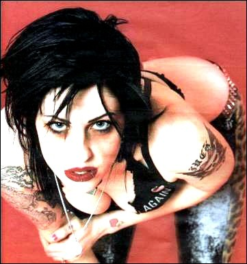
Here are two pictures of my sister who I would consider to fit the sub culture of Punks and people who like Rock music. She often goes to gigs and festivals such as Download and Hevy Festival. My sister dresses in dark clothing, has tattoos and her hair is brown with the side of it shaven (this can be quite a typical hair style for punks). Her favourite genre of music is rock, techno and punk. I think that she would fit the target audience as she is 20 and she is a female who likes the music which my media product has been designed for. I asked her what she thought of my media product and she gave me the following response: "I would probably buy this magazine because it has a lot of my favourite bands such as the Dropkick Murphys in it. I like it because I would be able to read about upcoming gigs and read about some of my favourite
bands."

My media product would aim to target audiences with readers such as my sister who is perhaps a more mature reader but is also interested in reading about bands and looking at additional features such as posters.

3) What kind of media institution might distribute your media product and why?

The music magazine, Warp, that I have created is a punk rock genre type magazine and I believe that it would be likely that a media institution such as BAUER media group would distribute my media product. This is because this media institution is known to distribute magazines such as Q and Kerrang.

After some research into this media institution, I drew a conclusion that this would be the best institution to distribute my media product. I discovered that it's circulation figures were quite impressive:

These figures were taken from their website and show the circulation for each magazine that they distribute from January-June 2010.


Although I have decided that Bauer media group would be the idea media institution to distribute my media product, I have also looked at IPC Media which distributes magazines such as the NME and Uncut. I have chosen Bauer media group because of it's excellent circulation figures and because my magazine is similar to Kerrang. However, IPC Media distributes the NME which I can compare my media product to because I have used it as inspiration for my contents page and double page spread. IPC media is another well known media institution but I feel that Bauer media group would be more likely to distribute my media product because it distributes Kerrang which is a similar genre of music to my magazine. If Warp was to published with magazines such as Q and Kerrang it would offer perhaps what is not on the current market to more social groups such as an equal gendered magazine and would circulate high figures because of Bauer's good track record.

2) How does your media product represent particular social groups?

The magazine, Warp, that I have created is designed to be read by an audience of both genders within the age group of 15-21 years old. I have created my magazine to suit the relevant social groups in relation to the punk rock genre of music. My magazine features information about festivals, bands, gigs and new releases which I think would cater to the interests of the target audience.

Punk rock is a genre of music which originated from the UK, USA and Australia in the 1970s. Punk bands created fast, hard -edged music which often had political and anti-establishment lyrics. Bands such as the Ramones became known in America and more rebellious groups such as the Clash and the Sex pistols formed in the UK. Punk bands like these were often reguarded as the start of new musical movement and they tended to reject mainstream music. From this type of music, youth in the UK could associated with punk subcultures which expressed their rebellion and aggression through their clothing and anti-authoritarian ideologies. By the 80s and even today, punk rock music has evolved to more hardcore styles such as alternative punk, post-punk and even pop punk.

Having researched what punk rock music is I was then able to decided if my magazine would be able to cater to this genre of music and if the readers would be stereotypical punks, emos, indie kids, metal heads, scene kids or grungers.

The model that I have used throughout my media product represents the subcultures of social groups such as punks and perhaps grungers or metal heads. I do not think that she represents social groups such as indie kids or scene kids as the music used in my media product is not of this genre. The media product that I have created uses features which would intrigue social groups who like punk rock and are of both genders in the age group of mid teens to early twenties. The model that I have used is only 17 but she does not look like a child and therefore this could make the magazine more appealing as the reader will be aware that the magazine features artists of similar ages and not young 'pop' groups.


I have compared the magazines such as NME, Kerrang, Blunt and Big Cheese which I used for my research. It is obvious that particular aspects have been covered and I have included my model and the model, Brody Dalle, from Blunt magazine which was used in my previous research. Although my model does not have that obvious punk look with a mohican and tight leather clothing; she does have dark hair and make up. Their expressions are similar as well as  their poses. The typical punk attitude is either 'stoner' or a 'I don't care' which I think I have portrayed through images of my model. My media product represents social groups of the mid teens to twenties who enjoy punk rock music and heavier music. I have done this through using my model who is dressed in dark clothing similar to Brody Dalle and uses expressions which show that she has attitude. The colours that I have used in my magazine tend to be dark colours such as black, red and white which also cater to punk and metal head social groups as they are often dressed in dark clothing and would not favour the colour pink.

1) In what ways does your media product use, develop or challenge forms and conventions of real media products?

Front Cover

Title

make avatarFor the title of my magazine I decided on a name quite quickly after researching music magazines such as the NME, Big Cheese, Kerrang, Blunt and Spin. I chose to create a punk rock genre magazine and from that I got the idea for the title Warp from the famous Warped Tour. It is a touring music and extreme sport festival which first started in 1994 as being predominantly  punk rock music but now  features a more varied line up of music.
From these magazine titles I was able to research into what makes a logo bold and memorable. Each of these magazine logos are written in capital letters to make them eye-catching. They are simple and usually contain two or three colours which does not over complicate the design. For my magazine title I did follow the typical structure of magazine logos and designed Warp in capital letters. I used two colours (black and white) to keep the colours minimal.
However, I think that I have challenged the typical magazine logo as I have spread each letter out so that it is large logo and I have made distanced so that it is not entirely solid like the NME logo is and the colour used is mainly white with black creating shadow on the letters. I have not used red which seems to be a commonly used colour for magazine logos as it stands out but I feel that my logo is noticeable and because it is simple it is memorable.

Pictures

When researching the type of photographs that I should use for my front cover I decided to look at the poses that the artists were seen to be in on the covers of magazines such as the NME, Spin and Big Cheese. The artists or bands are usually seen to be showing quite a stern, intimidating facial expressions. These magazines are targeted at mid teens to people in their early twenties of both genders so the artists are usually seen to be posing maturely. Sometimes they can be seen to be revealing such as Brody Dalle on the cover of Blunt magazine featured in my earlier research. These magazines are rock/punk/indie genre music so the artists will not appear as they may do in pop magazines.
I believe that my front cover for Warp magazine has followed my research and as shown in this cover of Big Cheese magazine the band are photographed looking intimidating whereas mine artist could be comparably intimidating but has more of a 'stoner' look. The genre of both magazines is punk and the artist on my magazine could be described as having a 'I don't care' kind of facial expression. I have not used any other photographs of other artists or bands, similarly to the Big Cheese, because I wanted the reader's attention to be focused on the artist. The price of Big Cheese is £3.75 so I thought that because my magazine is similar it would be a reasonable price for the target audience to pay as they are likely to have jobs and would be interested in the content of the magazine.

Contents Page


The contents page for Warp is majorly based on the contents page from the NME. This is because I really liked the simplistic structure of a the actual contents listed on the left and the image on the right. As you can see I did not include a box with information about a gig as shown on the NME contents page as I did not feel that it was relevant and the reader could read that kind of information inside. Instead, I placed a few page numbers with text around the image to draw the reader in. Underneath the image I used the promotion of subscribing to the Warp magazine as shown on the issue of the NME. I felt that this would be an essential part of the contents page as it would attract more readers to subscribe to the magazine for a cheaper price as the normal price of the magazine would £3.75.

Double Page Spread


When researching for my double page spread I mainly looked at the two double page spreads shown on the right. This is because they are both fairly similar and were the type of layout that I wanted to use for my own double page spread. I used the idea of having a main photograph on the right page and overlapped it slightly onto the left page. The target audience of my magazine is roughly 15-21 year olds so I did not want to make it childish and use lots of images. I liked the big title used on both of my research so I also did this and used different fonts to highlight certain words. Instead of including a small box with information shown in the top research spread, I used a quotation from the interview which I think the target audience would respond to and want to read the interview. The interview is written for the chosen audience and is not written too formally but is easy to read.

All of my final products link together with the research that I have done into specific areas of music magazines. I did not use every single piece of my research as some of it I did not feel was relevant but I mainly stuck to the layout and structures of the magazines that I have researched. The misc-en-scene of bar codes, page numbers, contents of the magazine are similar to those in my research. I think that my target audience of mid teens to early twenties would find my magazine suits their levels of maturity and can be read by both genders as it is not aimed at just boys or girls.

Wednesday, 23 March 2011

23/03/2011 - Warp Double Page Spread

This is the double page spread finished. I have shown the end result with the outlines of the page and without so that it is obvious how it has been structured like a double page spread.


I believe that the end outcome of my double page spread has closely followed my research of double page spreads in earlier blog entries.
I have placed the image from my research and from my double page spread to show how I was influenced to have the right side of the spread as a main feature for the reader to focus on an image of the artist. The artist in my spread is similar to the one on the right as her pose uses her arms and her right arm is positioned slightly onto the left page.

Although the font that I have used is different, I have tried to use a similar bold statement to the one used in my research and have changed the text of certain words which are strong and may attract the attention of the reader. From my research I have also learnt that it is important to keep consistent colours so I chose red, white and black.

Tuesday, 22 March 2011

15/03/2011 - First Draft of the interview for the double page spread

As Josie Stuart is preparing to promote her debut album all around the UK, Warp find out why she decided to call time on her band MGNX and why she hates reality television programmes.

Josie Stuart meets most expectations that Warp has of her when interviewer, John Green, is left waiting for her arrival two hours later than planned. When she finally appears she is dressed in a black dress and converses. She slouches in her seat as if she would rather be somewhere else.

Interviewer: So, Josie it’s nice to have you here. How are you feeling today?
Josie: Fine. I wasn’t late I just forgot to wake up on time.
Interviewer: Oh okay, well you must be pretty excited about releasing your own solo album after being with MGNX for seven years.
Josie: Yes. (She begins to cheer up) I’ve wanted to leave the band for about two years.
Interviewer: Really? MGNX has had global success. You started the band in secondary school with your brother and his friends and by the age of 20 you had two number one albums in the UK and America.
Josie: Well, I am obviously pleased with the success of the band. None of us expected to achieve so much and I am grateful for the opportunities that we’ve had over the years. I mean not everyone can say that they’ve played in as many venues all around the world as we have.
Interviewer: What made you want to leave?
Josie: Unless you’re in a band yourself, you don’t understand how much energy it requires. Being in a band is boring. You have to practice all of the time you can’t just be spontaneous, well, not once you’re signed. You have to conform to what your label and everyone else wants and it stops becoming fun. It stops becoming what you want and becomes what everyone else wants.
Interviewer: How did your brother feel about you wanting to leave?
Josie: He’s okay about it now; we’ve only just started speaking again. I probably should have told him before announcing it to the press.
Interviewer: It must have been a tough decision to leave a well established band and go solo.
Josie: Of course it was a hard choice to make but I didn’t want to be stuck in the band any longer. There were quite a lot of arguments and the material on our last album ‘Chariots’ was not the music that I wanted to release. My label told me that I had to “cater to a wider audience” and that meant writing a load of sh*t.
Interviewer: Do you think the band will ever get back together?
Josie: I don’t know. Other than my brother, none of us are on particularly good terms right now. I hope in the future we can talk again but I think MGNX is well and truly past it’s sell by date.
Interviewer: You’ve released your tour dates for the UK. Do you think you’ll perform better as a solo artist?
Josie: (She sits up straight in her seat and looks ecstatic). Yes! I am so excited to be playing with a backing band of musicians rather than my old band. I’m going to play in London venues first because that’s where I feel most comfortable and I know that I’ll have a fan base there…no matter how small it might be.
(Both interviewer and Josie laugh).
Interviewer: Would you ever consider mentoring on a programme like the X Factor?
Josie: Are you f***ing kidding me? I have no respect for anyone who goes on those types of shows. You’re selling your soul to the devil and I should know!
Interviewer: What about if Simon Cowell offered you £1,000,000?
Josie: No amount of money would make me go on that show. I’d really like to meet Simon Cowell so I can tell him how sh*t all his shows are. He is the ultimate anti Christ of the music industry. Don’t even get me started on Cheryl Cole. Louis seems like a laugh though. I love Irish people.
Interviewer: (Laughs) What about Big Brother?
Josie: There’s enough CCTV and press where I live. Why would I want more cameras following my every move? Actually, I’m quite used to that but no I’d rather stay away from trashy TV programmes.
Interviewer: The NME reported you a few months ago to be dating Josh Daner from The Kites. Is this true?
Josie: (She looks uncomfortable) Yeah. We didn’t really want to make it public but seeing as most people know now I’ll just say yes.
Interviewer: Will he be coming on tour with you? His band has just been signed hasn’t it?
Josie: I doubt it. We don’t want to be living inside each other’s pockets. I’m pleased that his band is a success but I don’t really want him to tour with me. If we’re with each other all the time then that really narrows down the topics of conversation that we can have when we get home.
Interviewer: Thanks Josie. Warp wishes you good luck with your solo career and I’m sure you’ll attract more fans as well as the existing ones.
Josie: No problem. Bye. (She rushes for the exit).

I have uploaded this to show the draft of the interview which may be altered depending on the content and if there is enough room for it in the layout of the double page spread.

15/03/2011 - Double Page Reseach & Draft

For my double page spread I have decided to obviously research double page spreads on famous artists and analyse the structure and layout of the page.

From the two double page spreads that I have researched, this is my favourite one. They are both similar as they have a photograph which is the main focal point on the right on the page. Most of all I like the edgy title used at the top of the page as it is similar to the punk style text that I have used on my front cover. For my own double page spread I think I will probably use a short quotation from the interview which is similar to this one and will attract the attention of the reader because it is bold. Underneath the title is a short piece of text about the singer and then the interview is structured in coloumns underneath. For my double page spread I will probably use a layout similar to this with the image of the singer on the right which slightly overlaps onto the left side of the page.


I also like this double page spread as it is similar to the one above and is quite a simple layout with the main text on the left and the image of the artist on the right. This double page spread does differ however as it includes a small box on the right of the double page which tells the reader some more information. I do like this but I think it would take the attention away from the interview and I would prefer to include another quote from the interview here instead. The title used here is bold yet again and different fonts and colours are used to give more variety and attract the reader. The colours used on this double page co-ordinate as they are mainly white, black and blue and therefore keep the details of colour and text minimal. A small piece about the singer is also included underneath the title and then the writing about the artist is structured in columns below.
This is the basic outline draft for my double page spread.

Wednesday, 16 March 2011

16/03/2011 - Warp Contents Page

make gif animation
I have included a gif to show the process of creating the contents page.


I have print screened the top section of my magazine and the contents page from an issue of NME to show how this research has helped create the contents page of Warp. From this issue of the NME I used the idea of a big bold title and used 'THIS WEEK' as it is strong and will attract the attention of the reader. It is simple and tells the reader exactly what will be inside this issue of the magazine this month. I have also used the idea of numbers in bold next to the page which it is relevant to. On my magazine I decided the include this around the image of Josie as I felt that it looked somewhat bare and would be similar to the research even though there are no other pictures as well.


This is the photograph that I used to include at the bottom of my contents page. My research shows that several images can be used on a contents page to give the reader something other than text to focus on. I have only chosen to include one other image because I liked the layout of one main image but I wanted to include another to add more of a visual effect. I think that this photo is appropriate as it is a picture of my friend that I took last summer and she is a teenager. She is dressed in red, fish net tights, chain necklaces and dark hair which fits the image of my magazine. For the purpose of my media product I have named her as 'Ivy Jetson' which sounds like the name of a solo artist.


As a final comment, I have used black and red colours to keep it simple but give a powerful look as they are strong colours. I have noticed from my research that red and black are prominent colours and they work well together. I am yet to include another picture of another artist on the contents page as I believe that this will improve the look of the contents page and will be supported by my research.


Tuesday, 8 March 2011

07/03/2011 - Contents Page Research & Draft

The layout of this contents page is clear and although there is a lot of images and writing, it is inviting and informative. The background is a light shade of grey which is not as over powering as a white background would be. There is colour coordination of yellow, black and white. I like this contents page as it is obvious what the page is, there is a message from the editor, there are pictures as well as writing about what will be inside. The list of pages is written on the right side and the reader is then able to see the main features highlighted by the images and the other pages on the right.


Overall, I do not really like this contents page as I think it is bland and boring. As a reader I do not feel compelled into reading on as there are no exciting images and the colours aren't vibrant enough to catch my attention. Obviously, the main feature that they are trying to promote is the free CD inside, but I would prefer to see pictures of bands featured inside. At the bottom of the page, there is information about subscribing to the magazine which is noticeable and I may use this as inspiration for my own contents page. The reader is able to view what is inside the magazine on the left hand side under 'What's Inside' but it does not look as interesting read because it is just a list of pages.

This is one of my favourite contents pages that I have found as I think that it is interesting and does not obey ordinary structures. It adds an element of fun to the contents page and gives the reader a sense of what else is inside the magazine. I like the use of images and underneath the page that it is linked to. The page numbers are bold and underneath some images are quotes from the page so this may encourage the reader to look at the page. The title 'Inside this week' is much more intriguing than 'Contents page'. I really like this layout and I will consider using concepts of it in my own contents page so that it is not dull to look at but remains informative like this page.
Although this contents page has a list of pages on the right which I don't really like because I think it is too much information and does not draw the reader in, I actually quite like this structure. My main reason for liking this contents page is because I like the image on the right which adds interest and shows a 'snapshot' from the NME awards. On the right is a little box with more information about the featured image which is likely to intrigue the reader to read on about the NME awards which is shown on the top right hand corner. Underneath is the subscription information about the magazine which I might use as it is enough way to gain readers. The colours used are white, black and red and this is consistent throughout the page (even in the image).
This is the draft for my contents page.